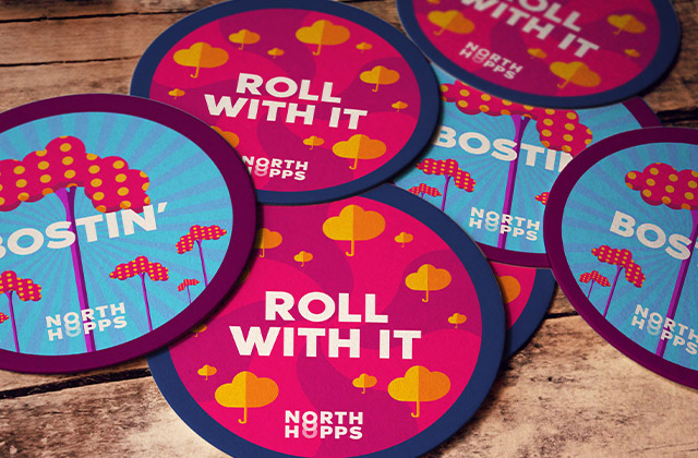
When designing the brand identity and product artwork for North Hopps, we focused on representing the cultural heritage and vibe of The North of England. Through themes of iconic music and imagery from The North, we wanted to show their inspirations and locations on each can.
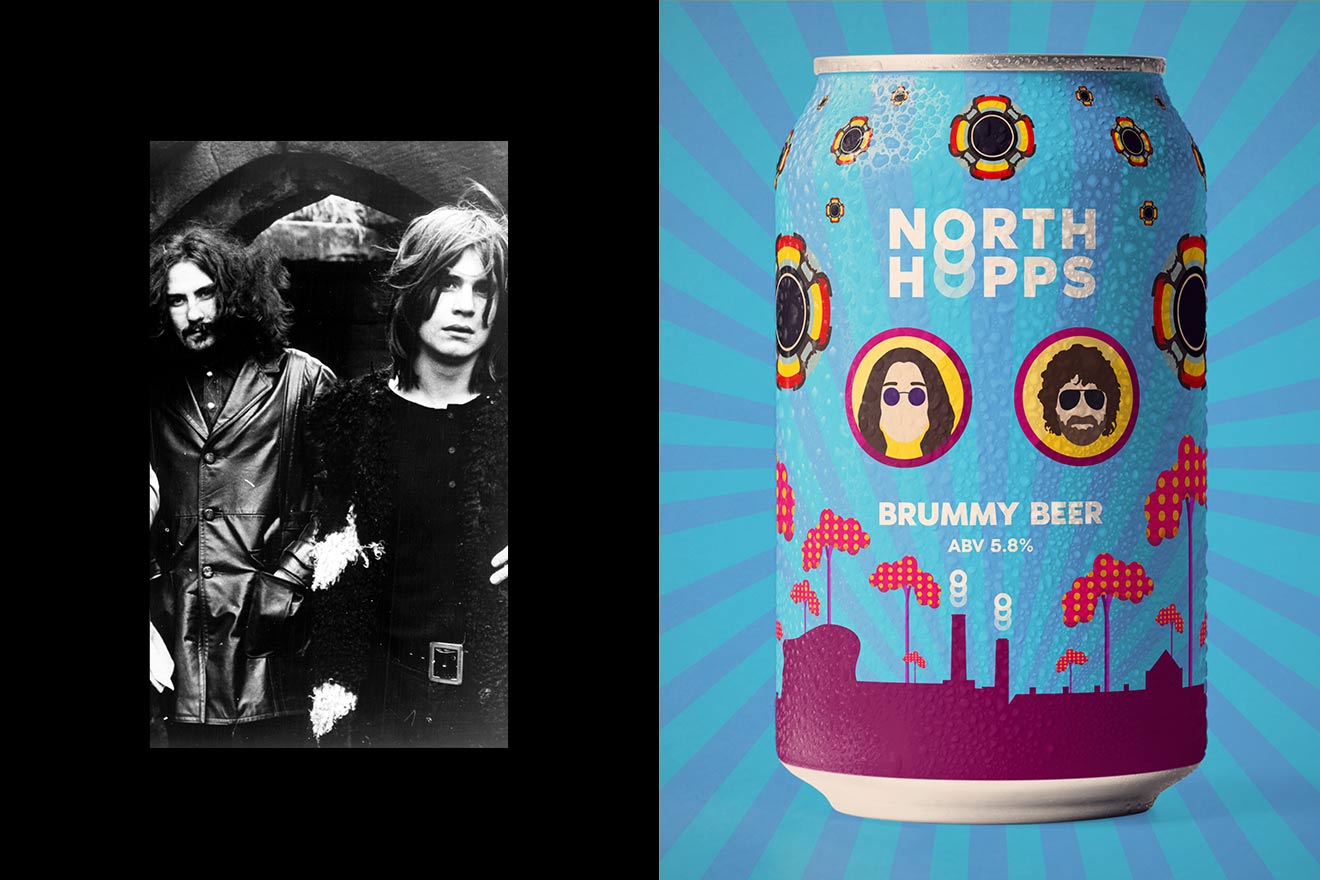
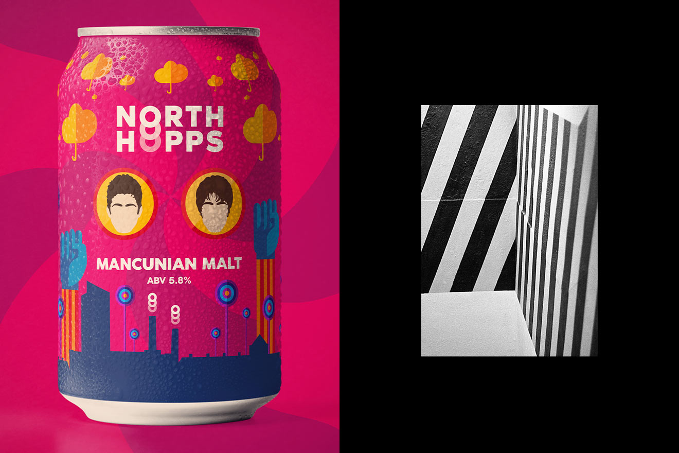
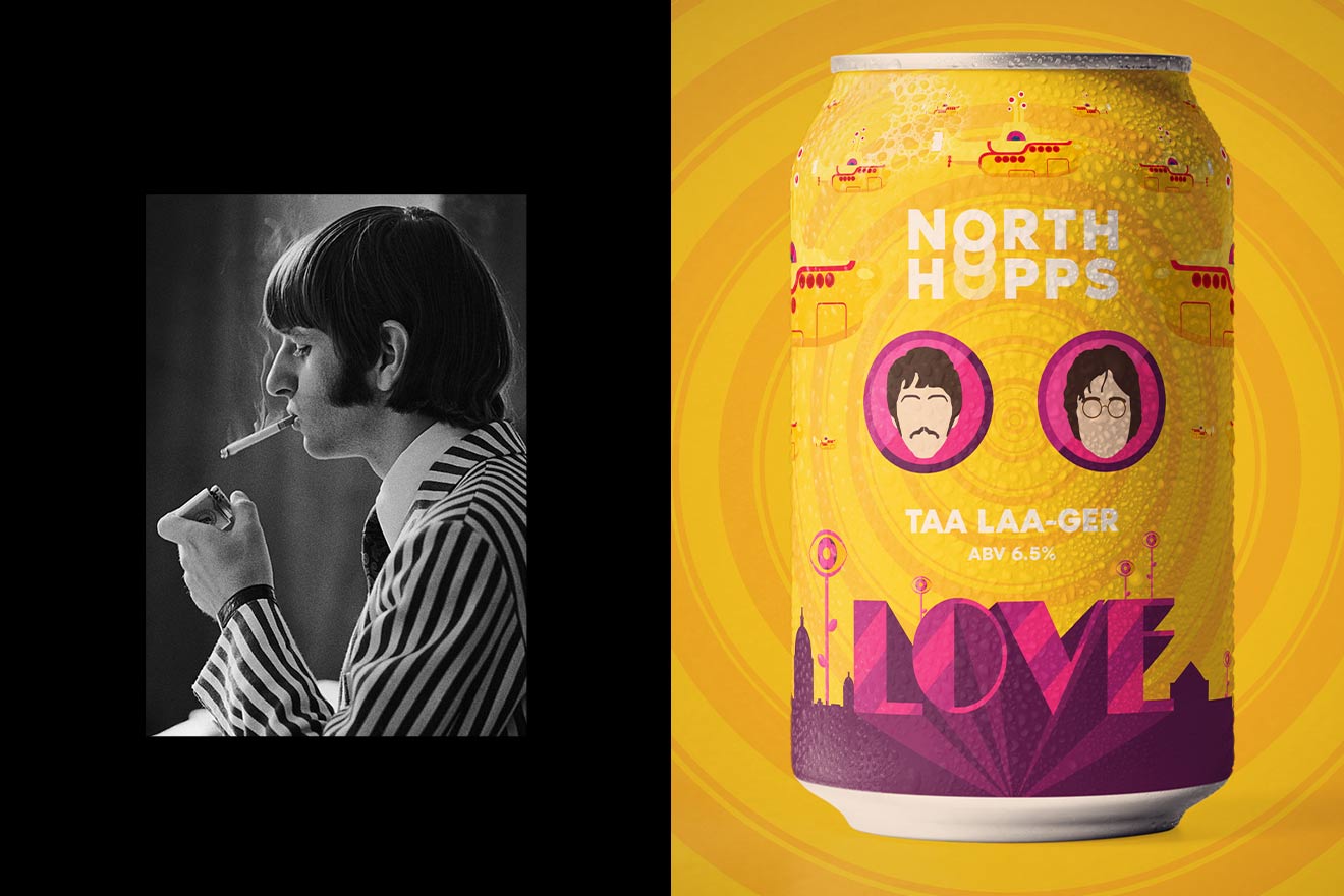
The beer cans we designed focus on Manchester, Liverpool and Birmingham. Taking inspiration from the most iconic bands to come from the North, The Beatles, Black Sabbath, ELO and Oasis.
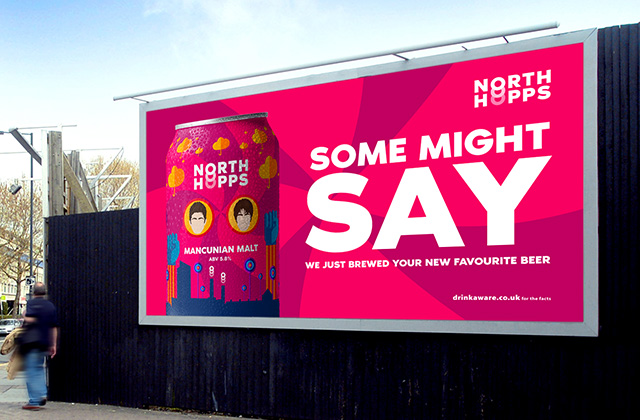
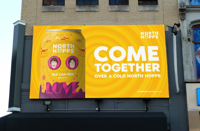
Consistent branding is important to consider when designing multiple cans for one brand. The cans for North Hopps are split into 3 sections, the skyline, the two artists in circles and the imagery floating over the top. Each can draws you in, a local from the area might try and spot recognisable buildings in the skyline, a music fan might see the faces of their idols and take a look.
For the Taa Laa-ger can, we utilised the famous Yellow Submarine aesthetic, alongside cultural references to the city. Creating an identity that jumps off the shelf whilst encompassing the pride of Liverpool and the iconic personalities to have come out of it.
Brummy Beer took inspiration from Ozzy Osbourne and Jeff Lynne, with the mancunian Malt bringing together Noel and Liam Gallagher. Each can has its own style and bright pop of colour, but the branding stays consistent throughout. You can see visually that they are all part of the same North Hopps brand.
